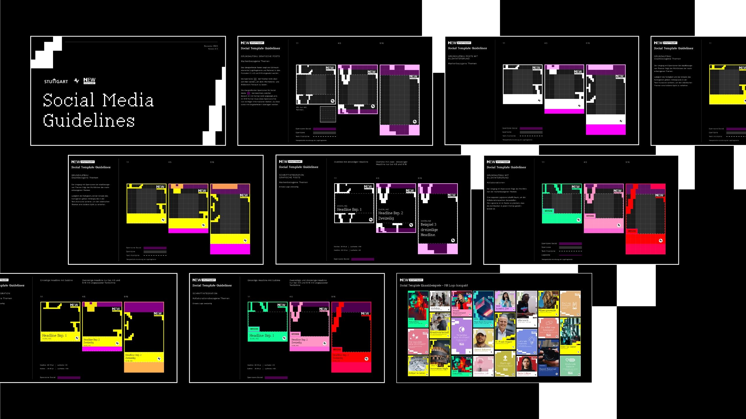
NEW Stuttgart sees itself as a platform for a wide variety of players. The location brand is a stage for everyone who wants to make a difference. It provides a framework for new ideas. This is exactly what we express with the design. The proverbial frame becomes an actual design element for us: the variability of Goethe creates an element that is constantly changing and yet ensures recognition.
A local brand that electrifies.
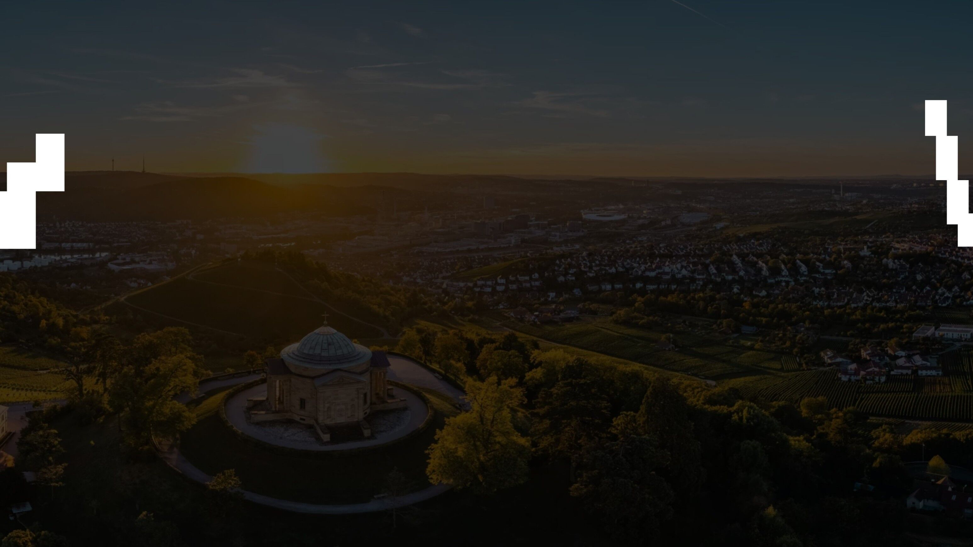
briefing
The City of Stuttgart's Economic Development Agency has set itself the task of driving forward the transformation in our innovation metropolis. The new location brand stands for sustainable, electrifying and economically strong and should therefore also unfold its full radiance to the outside world: with a progressive, loud and changeable design. We have also adopted these values for the design of the brand.
Categories
Public Institutions
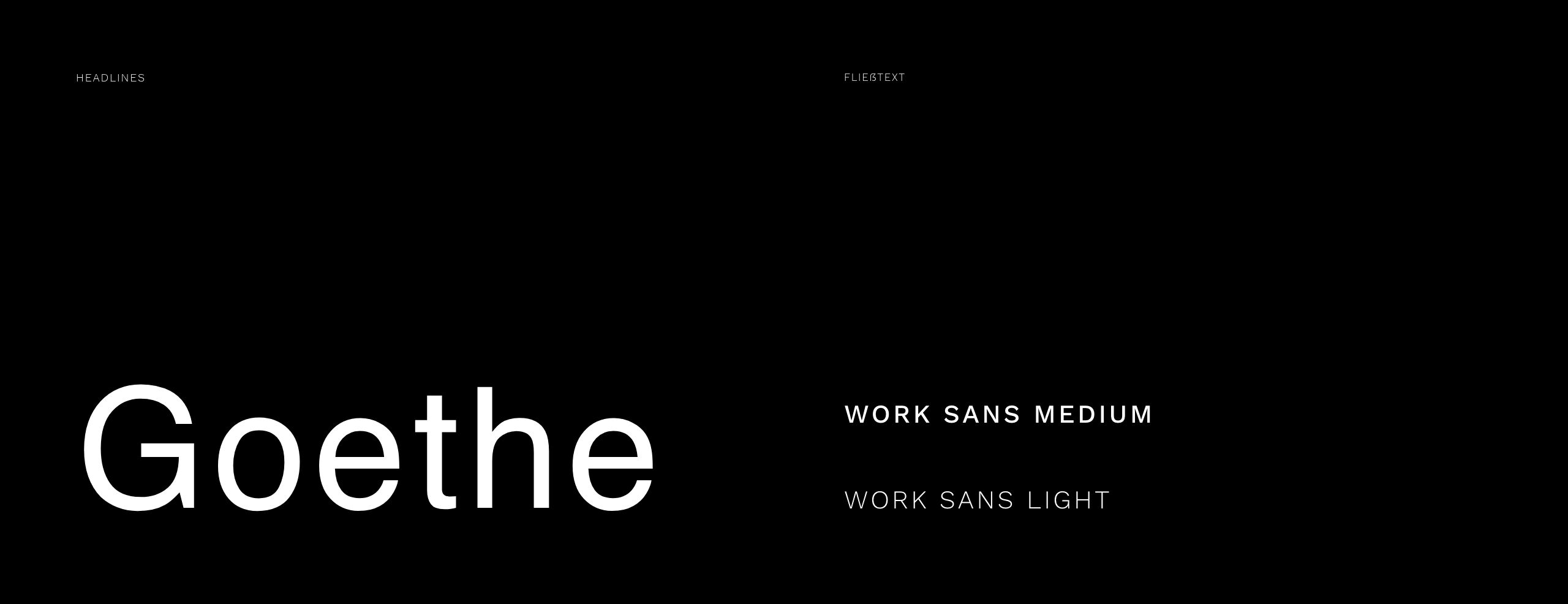
Type is our foundation in the truest sense of the word. It is a means of communication, a framework and a design element all in one. The modern serif font Goethe is used as a decorative font and is complemented by the clean yet expressive Work Sans in two weights. This creates a harmonious, reader-friendly and yet exciting and changeable image.
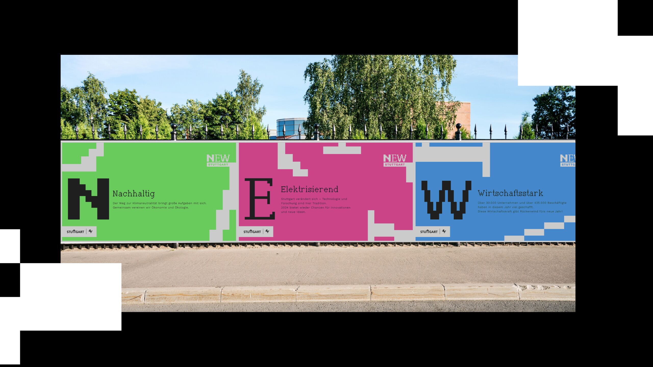
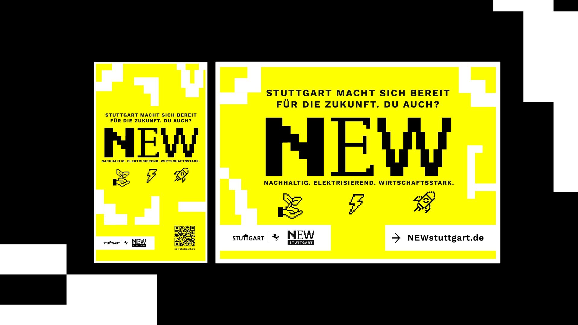
Stuttgart is in a state of flux, which is why our appearance never stands still. The colors complement the clean look and bring something electrifying to the location brand. Yellow as the primary color makes the city clear as the sender. Other colors are added as secondary colors as required. The purpose determines the color - free, exciting and vibrant.

A framework for the new. A stage for transformation.
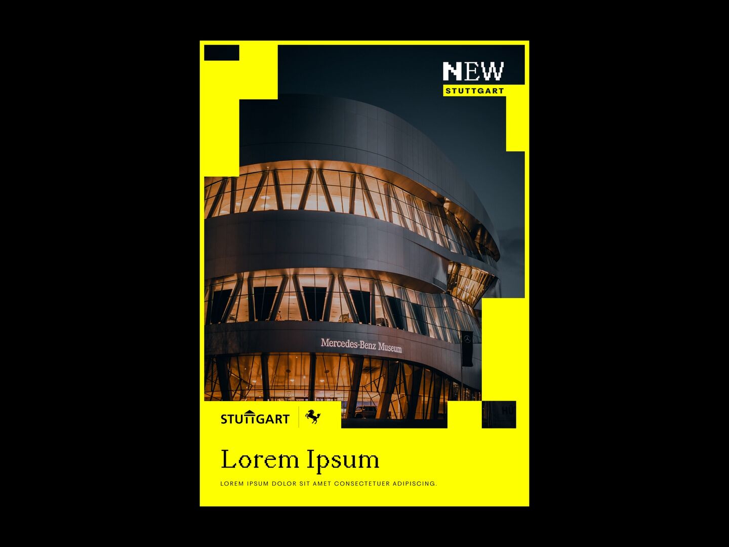
Leaves an impression everywhere.
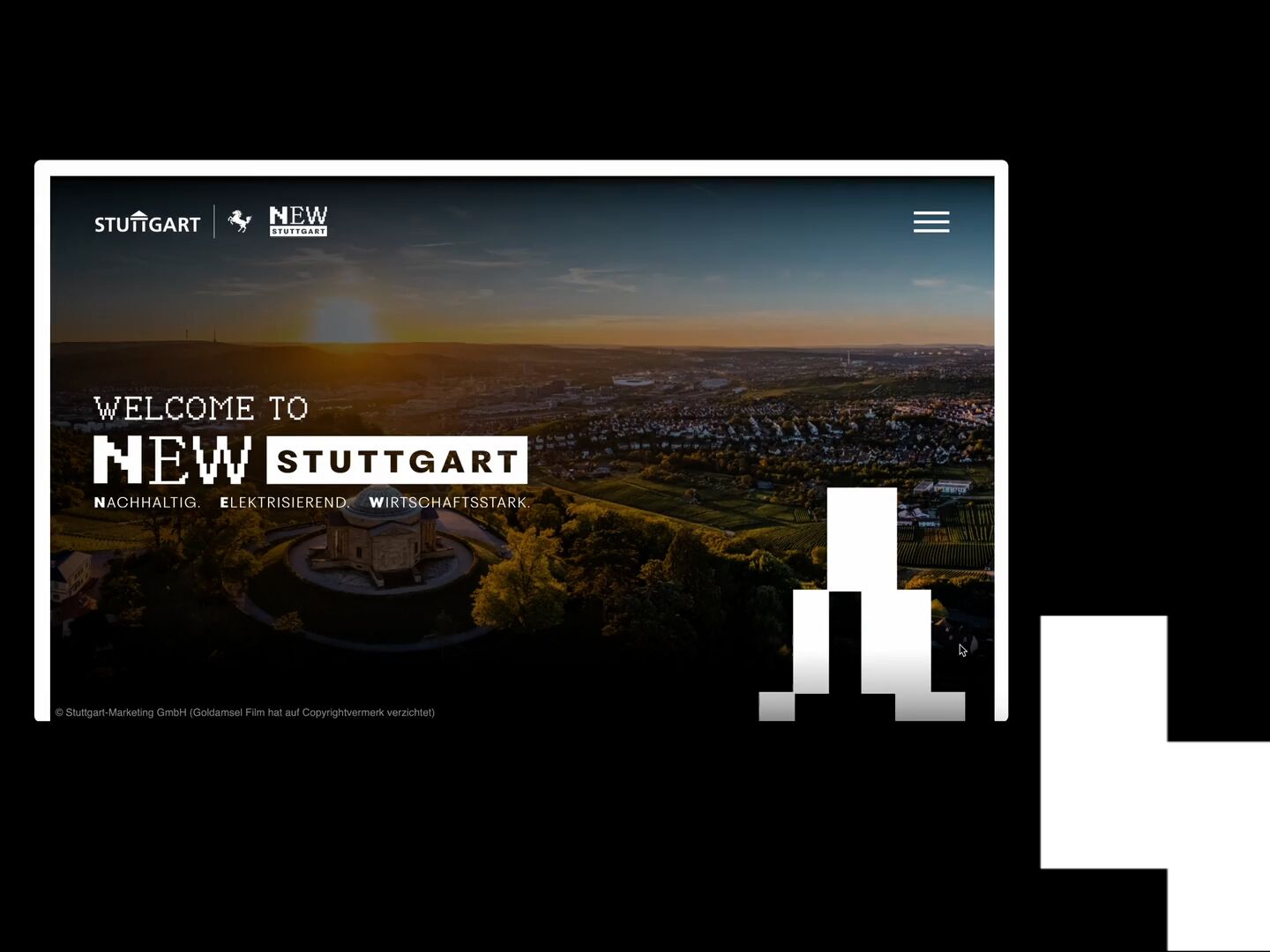
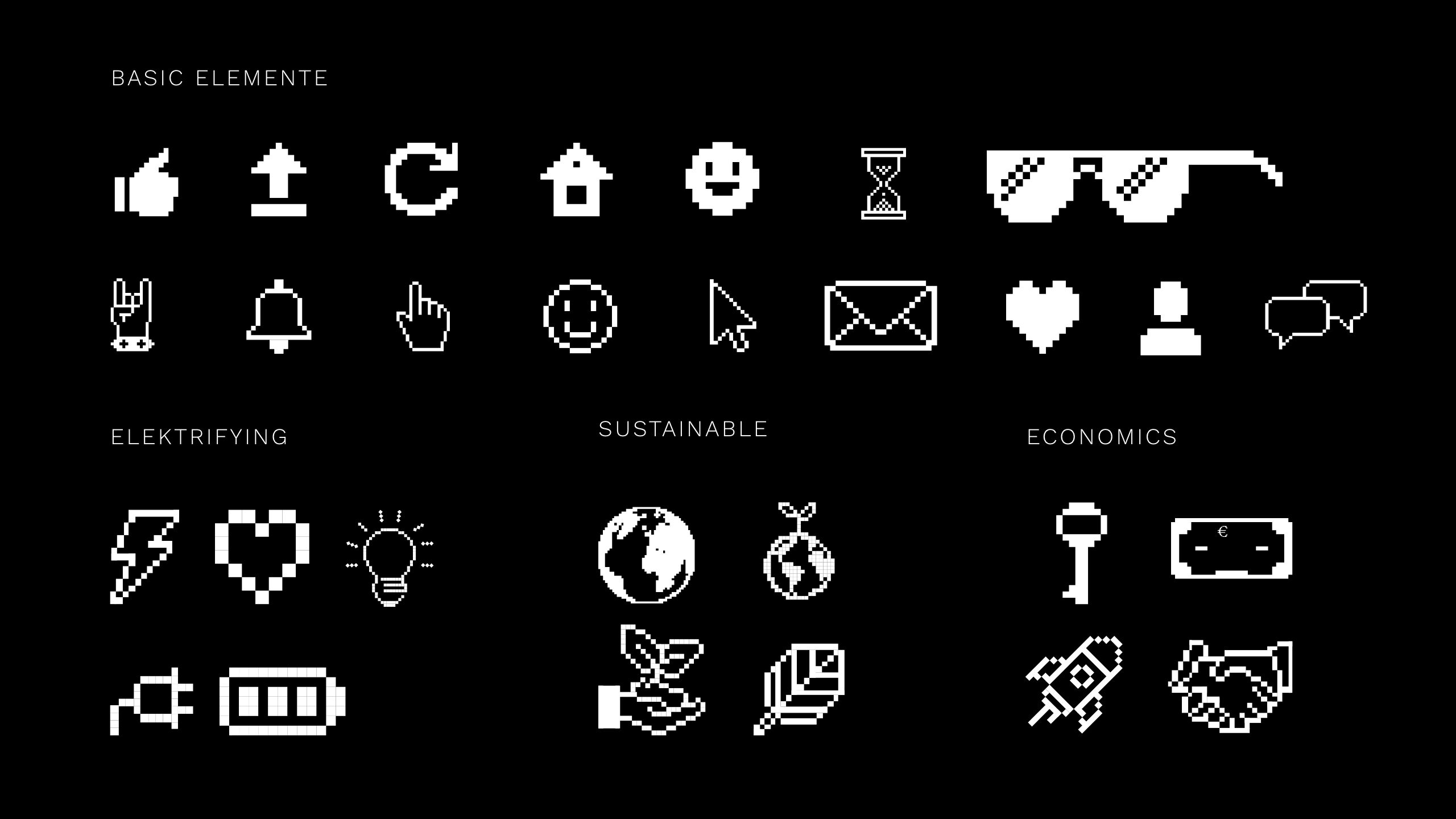
Whether on the web or on the street: the new brand design of the location brand makes an impression - both digitally and in print. The core messages of the acronym are always presented in the right light and thus remain in the memory. A variable play of colors and restrained use of icons put the icing on the cake of the design.
