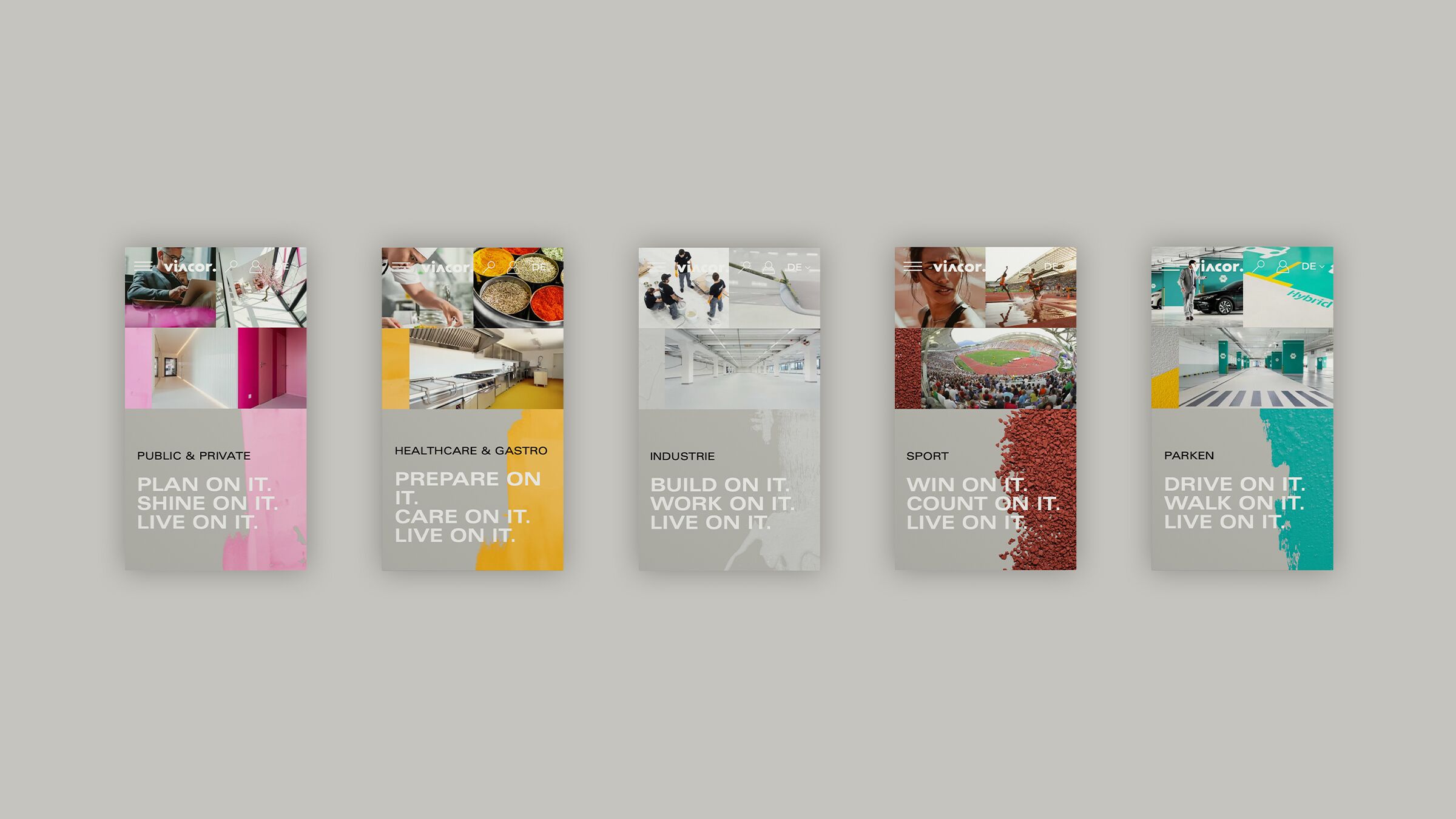
A lot of content means a lot of complexity. And resolving this was the particular challenge. We developed a UX that is truly intuitive. The result: the user retains an overview. A reduced layout with improved navigation, drop-down menus, close-ups and product recommendations makes it much easier to find content - and makes users happy. Even people with disabilities can now quickly find what they are looking for in data land. This means one thing above all: Viacor is well received by search engines.
Smart Card Design
briefing
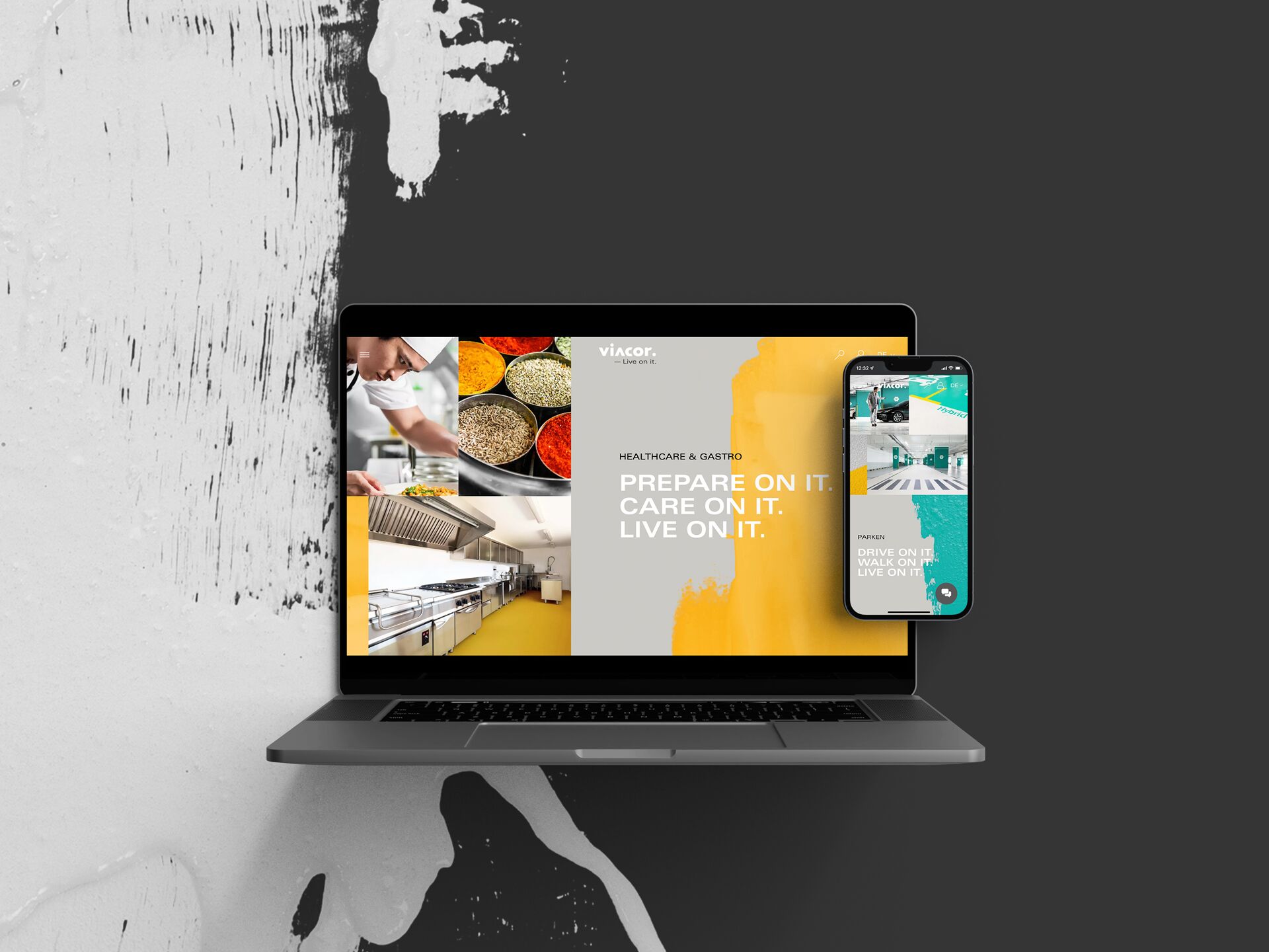
A strong brand needs a strong web presence. It should not only look smart, but also be fun. After sharpening the branding, we fundamentally sharpened Viacor's online presence - and delivered a smart web design that is truly functional. The user now not only gets information quickly, but also enjoys a unique digital experience.
Seeing the big picture thanks to sophisticated UX performance
Aimed at the user
A fully thought-out page structure with responsive and barrier-free content ensures unrestricted accessibility and fundamentally optimises the user flow.
Best cards
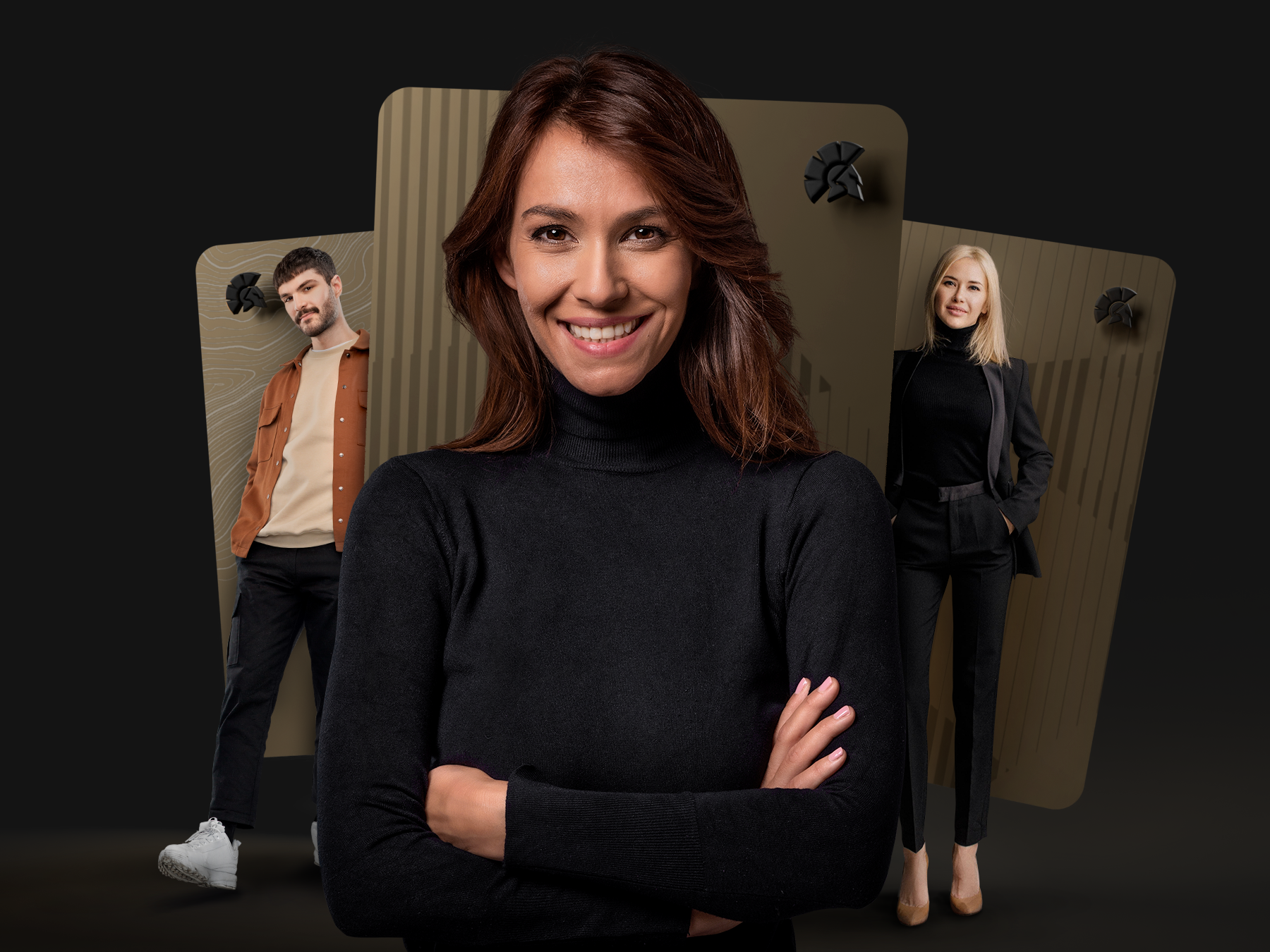
A reduced card design gave Viacor a real trump card: a UX that stands out from the competition. The smart arrangement of information was the key to the success of the project. For a better overview, information on the respective products in the catalogue is stacked behind a card. And these have been given a clear hierarchy. If the customer selects a product, he or she is then forwarded to further offers in this category. Because a smart website knows what the user wants.
