The website we developed is logically organized and visually striking. Its clear structure and simple navigation makes Dry Kings an attractive source of information on any device and leaves a lasting first impression.
A successful brand restoration
briefing
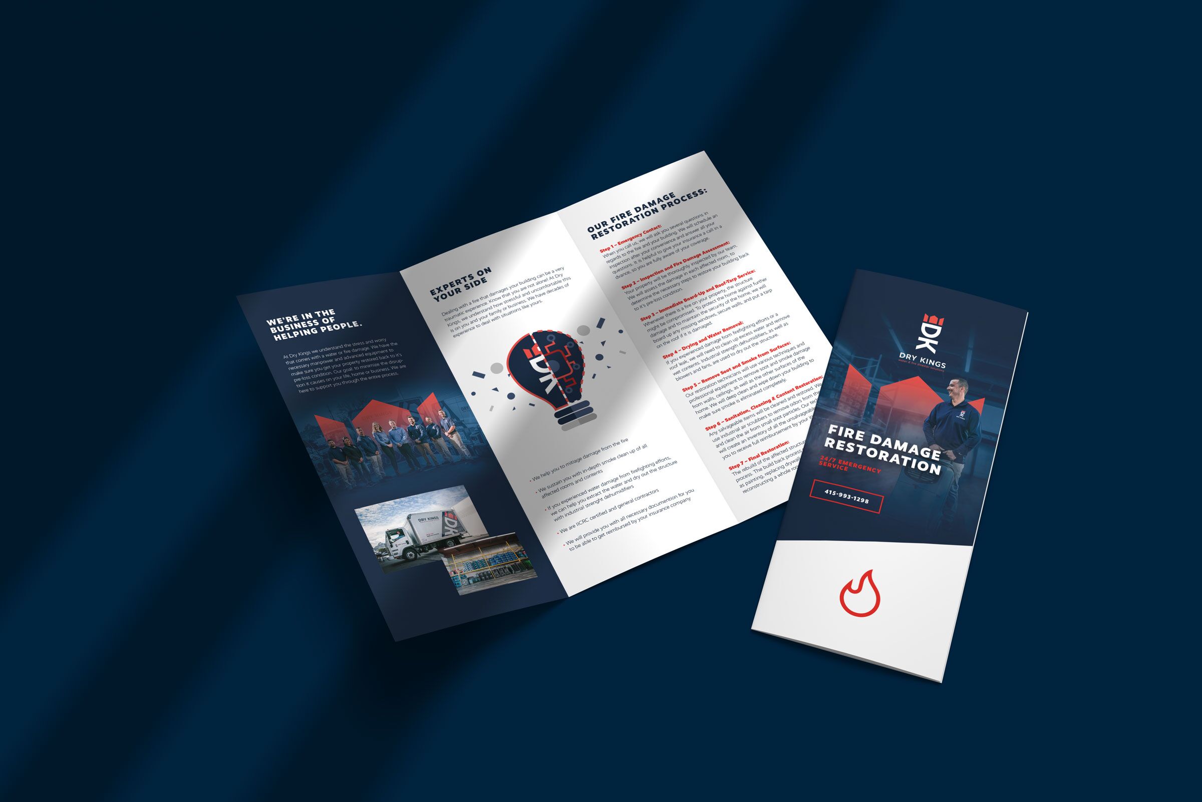
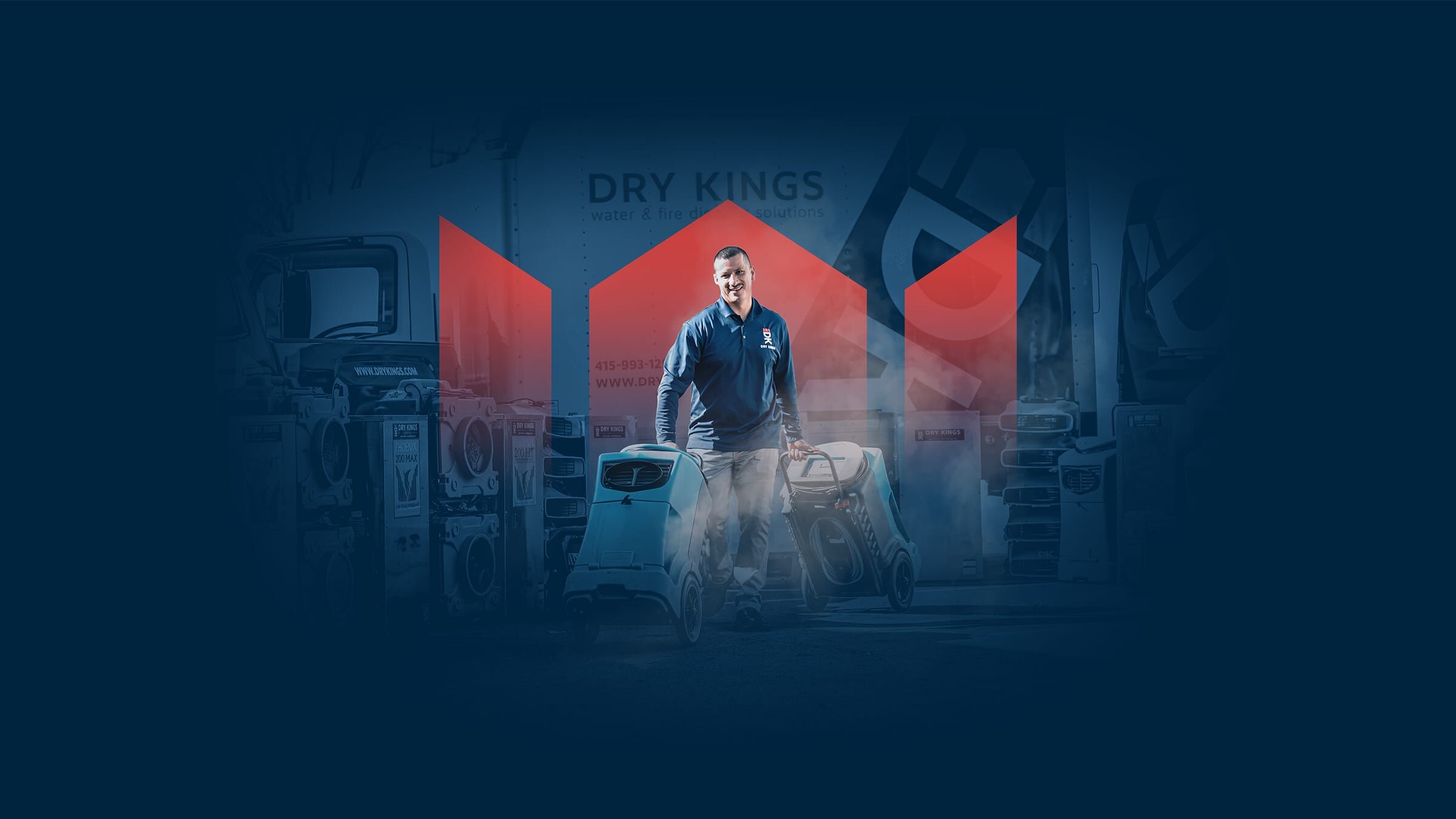
Dry Kings, a company based in the Bay Area in California, was looking for a new modern look that would reposition their brand and differentiate it from the competition. The result is a brand relaunch that combines the "American spirit" with clean European design. With a special emphasis on the digital touchpoint of the customer journey.
Categories
Industry
Modern handiwork
Digital insights
We also develop different formats and visuals for social media that provide information in easily digestible quantities. Directly from Stuttgart to the Bay Area and out into the world wide web.
Simply explained
An important component of the brand relaunch is simple illustrations that introduce the company's divisions. These infographics convey information in a very clear way, and can be either static or animated.
A logical development
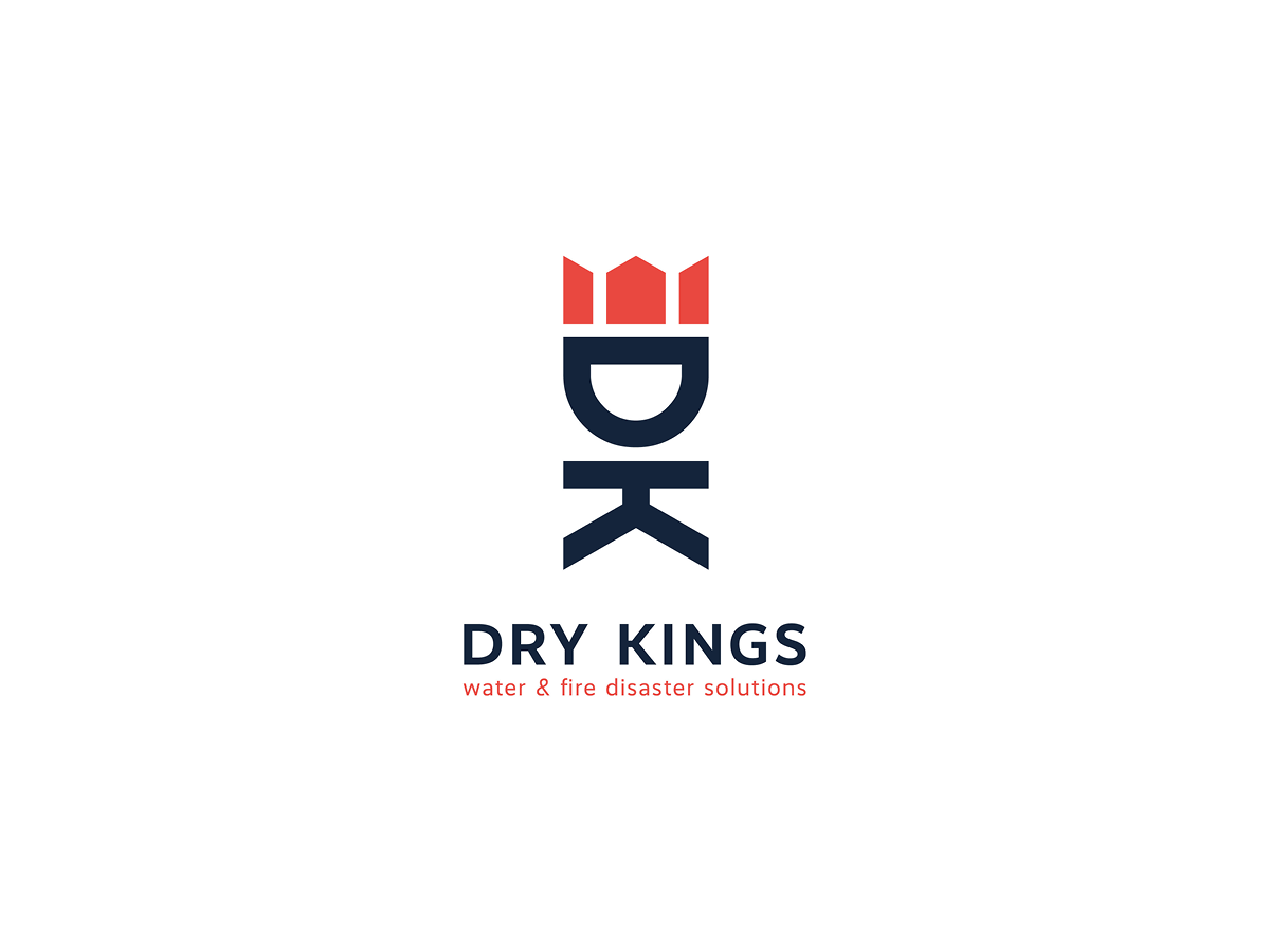
The new logo has just two components, but at the same time, it depicts all of the important elements relevant to the company. The roof represents both a crown and a house, reflecting Dry Kings' name and their work environment. The crowning touch: the first initials of Dry Kings create a figure that functions as a standalone logo even without the company name.
Simple diversity
We have developed icons for the four pillars of the company. These show quickly and clearly which services Dry Kings offers.
Elemental colors
- R 255
- G 68
- B 58
#FF443A
- R 0
- G 35
- B 62
#00233E
- R 255
- G 255
- B 255
#FFFFFF
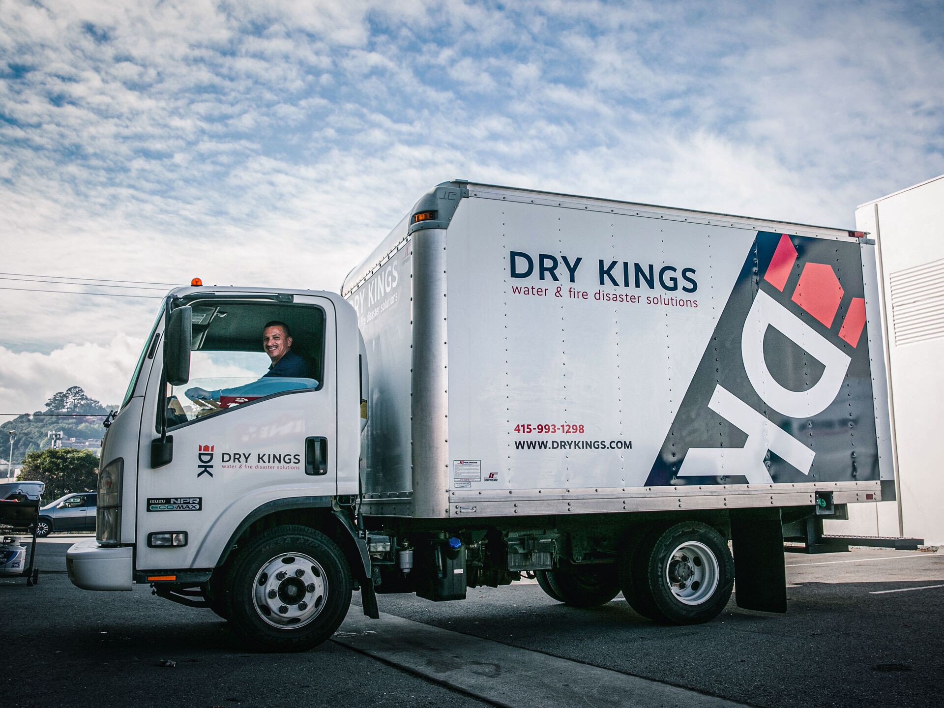
Mobile brand ambassadors
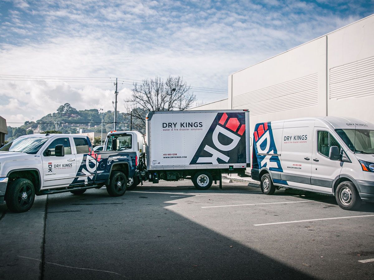
The new design was enthusiastically received and was directly implemented for the entire vehicle fleet. The complete brand identity is thus reflected in the new look - from business stationery to vehicle wrapping.
