How does UX design become good UX design? Our entertaining explanatory film answers this question concisely, translating the sometimes complex topic of UX into easily digestible messages.
Mindset shift in UX training

briefing
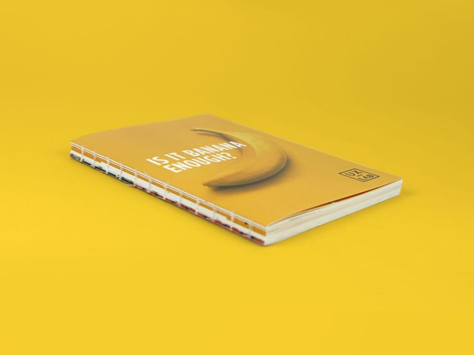
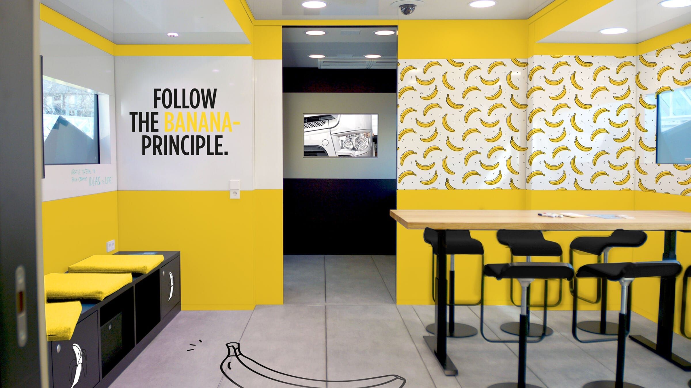
The UX Lab is a separate department that handles UX design of internal tools and applications at Daimler. VON HELDEN UND GESTALTEN created a campaign to promote awareness of how to use UX design to provide the best possible user experience. The campaign included a toolbox and associated training materials, along with promotional items and viral elements that introduced the topic of UX design within the company in a fun way.
Categories
Industry
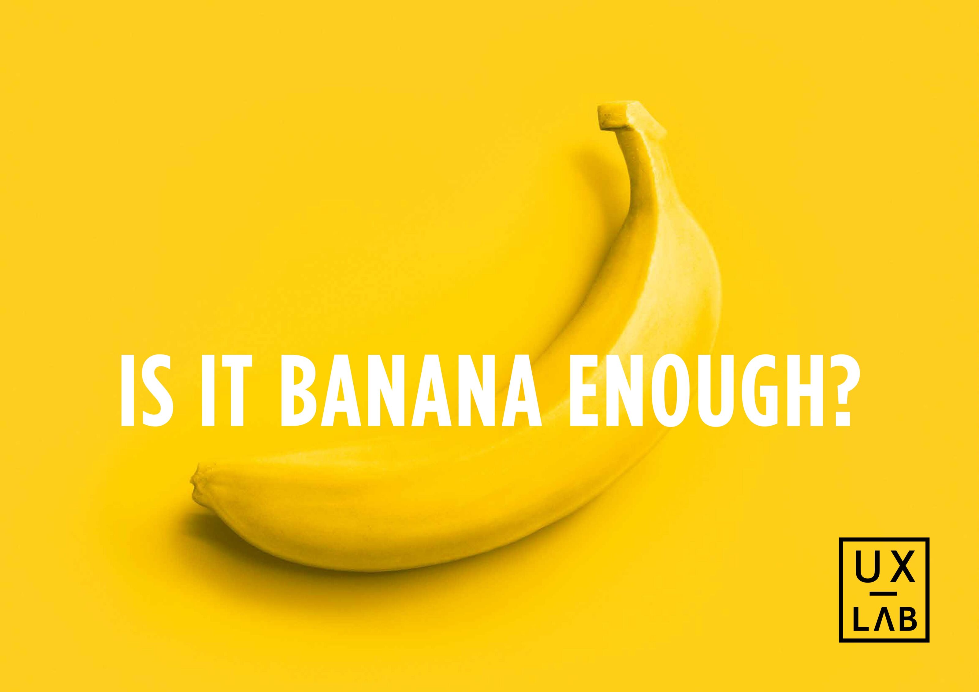
Is it Banana enough?
Everything’s coming up banana
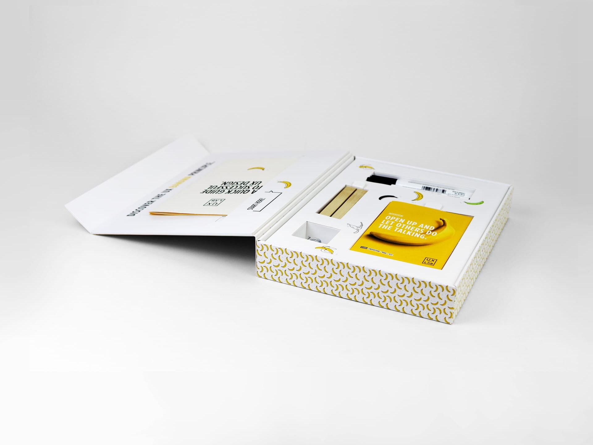
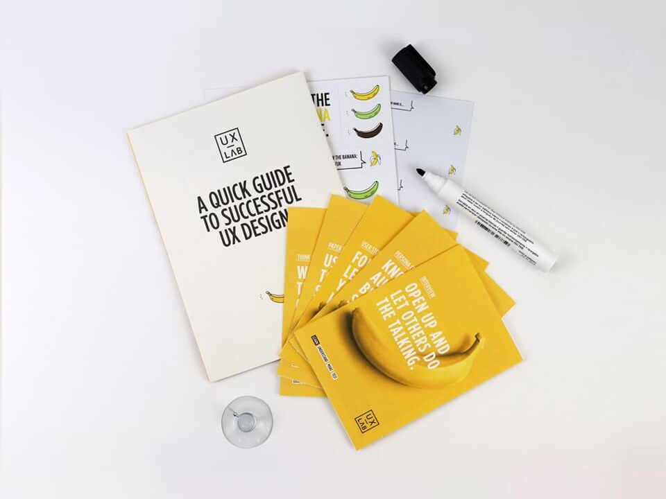
One of the core elements of our campaign is a toolbox for workshops. It is designed to introduce participants to the topic of UX design in a simple and playful way and to provide them with all the materials they need to get started with the workshop exercises.
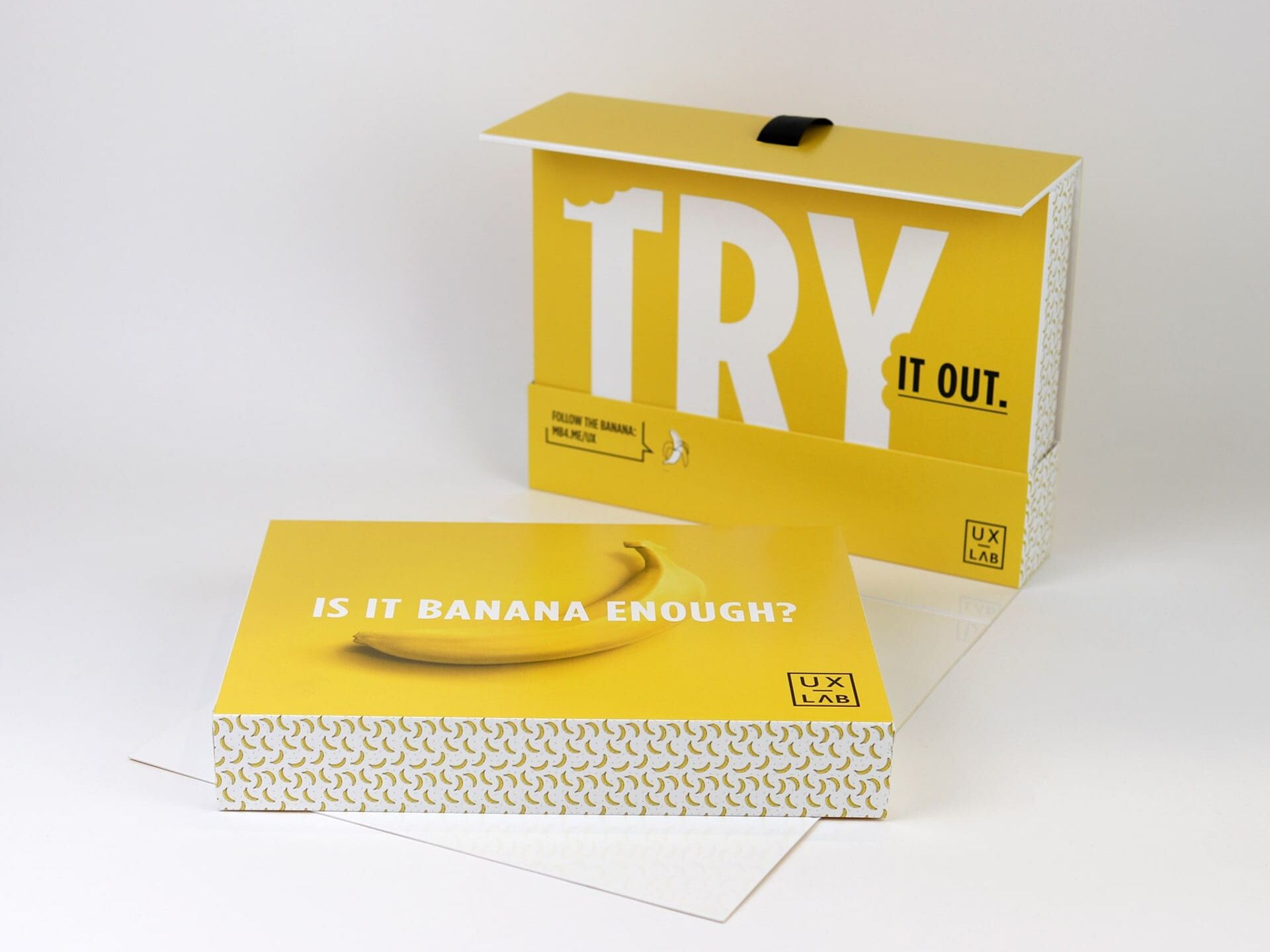
A question of ripeness
Yellow
- R 255
- G 213
- B 47
#FFD52F
Green
- R 199
- G 222
- B 116
#C7DE74
Brown
- R 53
- G 35
- B 31
#35231F
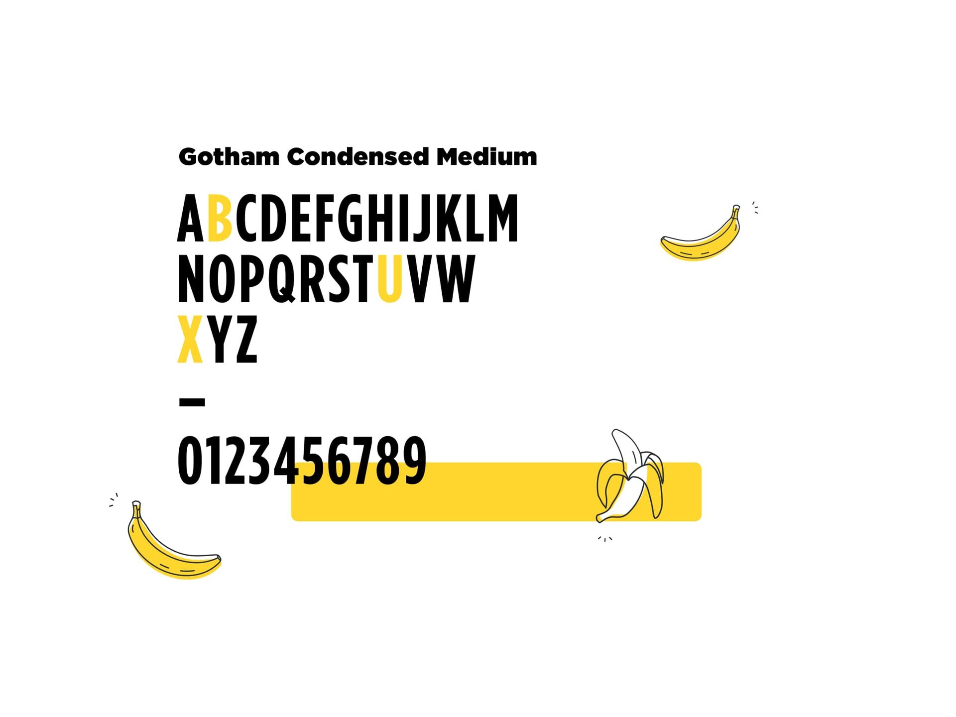
A clean typeface
To make our „banana“ messages perfectly clear, we chose a plain and straight forward font. Good readability was one of our main criteria, because the campaign focuses on digital applications.
